Graphic Design Theory: 50 Resources and Articles
As designers, we often focus on the practical aspects of design above all else. We focus on what works, with little regard for why it works. And in our day-to-day work, that outlook serves us well. It lets us get our work done in an efficient, professional manner, and generally nets good results.
But spending some time on the theory behind the graphic design principles we use every day can expand our design horizons. It can open up new avenues of creativity and experimentation that can lead our designs from just good, to fantastic. On that note, below are 50 excellent resources and articles that discuss graphic design theory, including layout, color theory, and typography. Feel free to share additional resources and articles in the comments.
General Design Theory

There are a lot of general design theories and principles out there that apply to all forms of design, whether in digital or print mediums. These include things like balance and scale, as well as more abstract topics like emotion and what makes for “good” design.
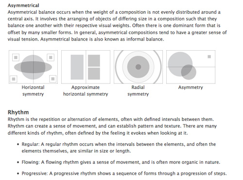
The Principles of Design
This article from Digital Web Magazine covers the basics of design theory, including balance, rhythm, proportion, dominance, and unity. It’s fully illustrated and makes each principle easy to understand.
Graphic Design Theory?
This article from the AIGA archives offers a broad discussion of graphic design theory, offering guidance for designers on a host of topics, including their place within the current DIY culture.
How Good is Good?
This article from Typotheque talks about good design in relation to what the design is for, especially in relation to non-profit causes. There’s a heavy dose of ethical considerations here, as well as some practical information on what makes a good design.
Can Graphic Design Make You Cry?
This article from Design Observer discusses the question, “How…could you make design that communicated to human beings and deliberately drain it of all human content?”
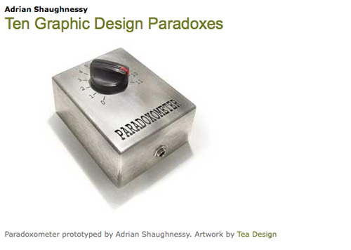
Ten Graphic Design Paradoxes
This article discusses ten of the most common statements or opinions about graphic designers (or said by graphic designers) that are contrary to accepted wisdom. Included are things like “For designers, verbal skills are as important as visual skills,” and “I’m a professional: I know best.”
The Lost Principles of Design
An illustrated guide to the basic principles of graphic design. Included are explanations of balance, contrast, emphasis and subordination, directional forces, and proportion, among others.
The Laws of Simplicity
This article is actually excerpted material from the book of the same name by John Maeda. It covers ten basic principles to guide simple and minimalist designs.
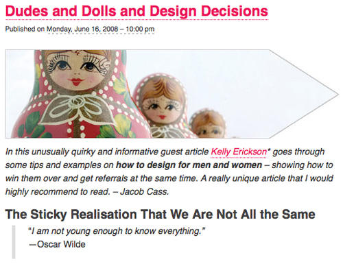
Dudes and Dolls and Design Decisions
This post by Jacob Cass discusses the psychological differences to consider when designing for men or women. It’s a practical discussion of what women respond to versus men, as well as how to effectively design for both.
The Complexity of Simplicity
This article discusses how complex simplicity can actually be, including perceived versus actual simplicity.
Want to Know How to Design? Learn the Basics
This article discusses the most basic principles of graphic design, including color, shape, scale and size, and space, among others. Additional resources for each are also included.
C.R.A.P.: The Four Principles of Sound Design
This article from DailyBlogTips offers up information on four basic principles of good design: Contrast, Repetition, Alignment, and Proximity (C.R.A.P.).
Classic Graphic Design Theory
Don’t let the design of this site fool you; the content contained here offers a great overview of classic graphic design principles, like shape, texture, movement, balance and unity.
Simplicity is Highly Overrated
This article discusses simplicity and the idea that it’s not actually what consumers want.
Layout Principles

Layout principles and theories are varied, but most fall into one of two camps: grid-based design and non-grid-based design. Each one has its adherents, and each one has its advantages and disadvantages. There are also layout principles like white space and proximity to consider, all of which are discussed below.
The Grid: The Structure of Design
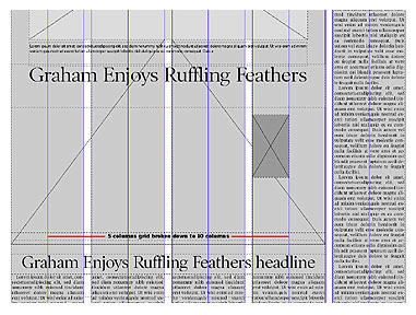
This post discusses grid layouts, mostly in relation to newspaper design. It discusses both horizontal and vertical grids, and can easily be applied to other graphic design projects, including website design.
Fundamental Design Principles for Web Page Layout
This article covers a design layout principles based on the Golden Ratio and divine proportion. It offers both theory and practice related to implementing the divine proportion in your site designs.
Designing With Grid-Based Approach
This post covers grid design in theory and practice, with examples, quotes about grid design from well-known designers, and a number of additional resources.
Five Simple Steps to Designing Grid Systems – Part 1
This is the first in a series of posts from Mark Boulton on grid design that delves into both the theory behind grid-based design and practical application of that theory.
Grid Design Basics: Grids for Web Page Layouts
This article discusses the principles behind grid-based design, as well as offering basic instruction for incorporating grids into your designs.
Seven Smooth Steps to Superb Grids
This post gives step-by-step instructions for understanding, developing and using grids for page layout. Also included are additional resources for each step.
Thinking Outside the Grid
This older article from A List Apart discusses why it’s sometimes a good idea to step outside the grid, and how to actually do so.
On Grid Design
A brief commentary on grid design from Warpspire, including why most so-called grids in web design are nothing more than integer-based symmetry, and aren’t really “grids” at all.
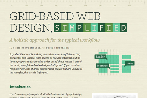
Grid-Based Web Design, Simplified
This article discusses both the practical application of a grid-based layout and how it can be integrated directly into your workflow, but also some basic theory behind grid design.
Why I Hate Grid Systems…
This post from SoyRex discusses the shortfalls of grid design and what it means to the design industry. It’s an interesting take on how grid-based design can lead to formulaic designs and devalues the industry.
Canons of Page Construction
This Wikipedia article discusses the principles in the field of book design called the canons of page construction, that deal with things like margins, proportions, and type areas. While written specifically for book design, they can easily be applied to other areas of graphic and web design.
Negative Space
This article from Layers Magazine talks about the importance of negative space in designs, including multiple examples.
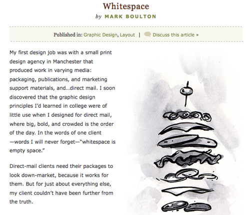
Whitespace
This article from A List Apart by Mark Boulton discusses the importance of whitespace (negative space) and how to achieve it. He also talks about why whitespace is important in terms of legibility.
White Space: How to Get it ‘Right’
This post from Carsonified talks about how white space is important to web design, and how to achieve proper levels of negative space in your designs.
The Principles of Good Web Design Part 1: Layout
The first post in this series offers some great information about the theories behind good website layout, including white space, flow, and alignment.
The Principle of Proximity in Web Design
This post talks about proximity and how it relates to effective layouts. Visual hierarchy, grouping related elements, and white space are all discussed.
Color Theory

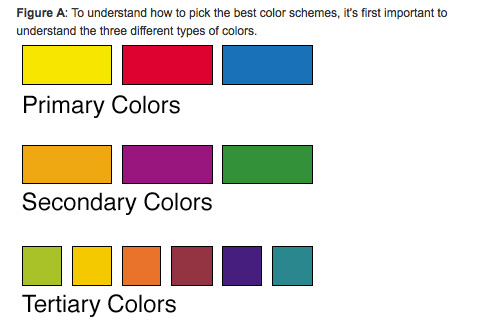
Color theory can often be one of the most intimidating aspects of design. Sure, most of us know what looks good, but do we have any idea why? And what about those designers who aren’t as comfortable with their color palette choices? The resources below discuss color theory as it relates to graphic design, and specifically to web design.
Learning to Use Color on Your Web Site
This post gives a brief introduction to color theory, with specific information for color theory online. It’s a good starting point for anyone completely new to color theory.
Choosing Color Combinations
This post from Veerle’s Blog offers up a pretty comprehensive view on how to create color schemes, including a crash course in color theory.
Color Theory for the Color-Blind
This article from Digital Web Magazine offers up tips for designers who are color-blind. It also includes a section for non-color-blind designers for designing for those who might be color blind.
A Look Into Color Theory in Web Design
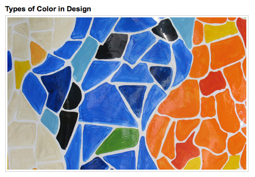
This post from Six Revisions covers color theory in direct relation to web design, including color meanings and a gallery of websites and commentary how they use color.
Color Theory for Designers, Part 1: The Meaning of Color
The first part in my 3-part series on color theory. This article covers the meanings of the different colors, as well as examples of how each color is commonly used in web design. Part 2 covers color theory concepts and terminology, and Part 3 discusses how to create your own color palettes.
Simple, Practical Color Theory
This post from Tutorial9 covers the basics of color theory, including color models; harmony; term definitions; and hue, saturation and brightness. It’s well-illustrated and gives a great overview of how color theory relates to design.
Typography

Typography is one of the most important aspects of graphic design, whether in the digital or print worlds. And with the thousands of typeface choices out there, it can also be just as intimidating as color theory to a lot of designers. The resources below can help improve your understanding of what makes good typography and what doesn’t.
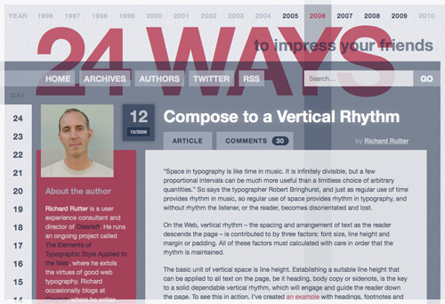
Compose to a Vertical Rhythm
This post from 24 Ways talks about the importance of vertical rhythm in relation to typography, as well as offering a number of practical tips for implementing vertical rhythm in your own designs.
The Principles of Beautiful Typography
This post from SitePoint focuses mostly on typography in relation to website design. It discusses the basics of different methods for including fonts on your site (including web-safe fonts and sIFR), as well as the anatomy of a typeface and other related topics.
Basic Typographical Principles
A brief article that covers some very basic typography principles. While it’s a bit of an older article, the information it contains is still relevant.
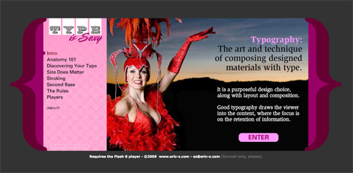
Type IS Sexy
The Type IS Sexy website offers up a complete lesson in basic typography. Everything from the anatomy of a typeface to special characters and the rules of good typography. And it’s all presented in an easy-to-understand, interactive format.
dot-font: Seven Principles of Typographic Contrast
This article is derived from Carl Dair’s teaching of visual contrast in relation to typography and how it makes the meaning of a design immediately apparent. Principles covered include weight, form, and size, among others.
Five Simple Steps to Better Typography
This series of posts from Mark Boulton covers the basics of better typography, covering Measure, hanging punctuation, ligatures, size and weight. It’s a very thorough guide to improving your typography designs, all laid out in a simple to understand format.
The Type Studio / The Written Word
This page offers links to a number of articles on typography, including PDF versions of archived fy(t)i (For Your Typographic Information) columns. These cover individual typography topics in detail, for both online and offline applications (including pull-quotes, visual alignment, bullets, and emphasis, among more than 30 others).
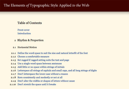
The Elements of Typography Applied to the Web
This is one of the most complete web typography guides out there. It’s still a work-in-progress, but already covers things like horizontal and vertical motion, rhythm and proportion, and the etiquette of hyphenation and pagination.
15 Tips to Choosing a Good Text Type
This is a comprehensive guide to the things one should consider when choosing a typeface for body text. Included are tips about letterforms, weight, axis, x-height, and letter spacing.
On Web Typography
This article from A List Apart by Jason Santa Maria explores choosing and pairing fonts on the web, particularly in relation to the expanded options @font-face provides.
Setting Type on the Web to a Baseline Grid
This is a practical, how-to article from A List Apart, written by Wilson Miner, on how to set your web typography to a baseline grid. Examples and code are both given, making it very easy to follow.
Clagnut Typography Archive
Clagnut’s typography category archive is filled with great information on typography spanning the past eight years or so. Articles talking about theory, news, and technique are all included.
Choosing Type Alignments for the Web
This post from Astheria covers the benefits and drawbacks of justified and ragged (both left and right) type alignment on the web to help you decide which is appropriate for your projects.
Know Your Type
This article by Red Labor discusses typographic inspiration and choices based on slightly different criteria than many other articles. It talks about clarity and utility, scale, and type as a design element of equal importance to graphic elements in a design.
10 Principles for Readable Web Typography
This post covers ten important considerations for creating readable web type. It also covers a number of typographic techniques and how to incorporate them to make more readable web pages.

